Wednesday 14 May 2014
evaluation
slideshare to answer the question how did you attract/ address your audience?
slideshare answer the question how did you attract/ address your audience?
Monday 12 May 2014
preliminary task

This is my first attempt at a school magazine, Im happy with my work if i was to improve it I would lay my text out differently.
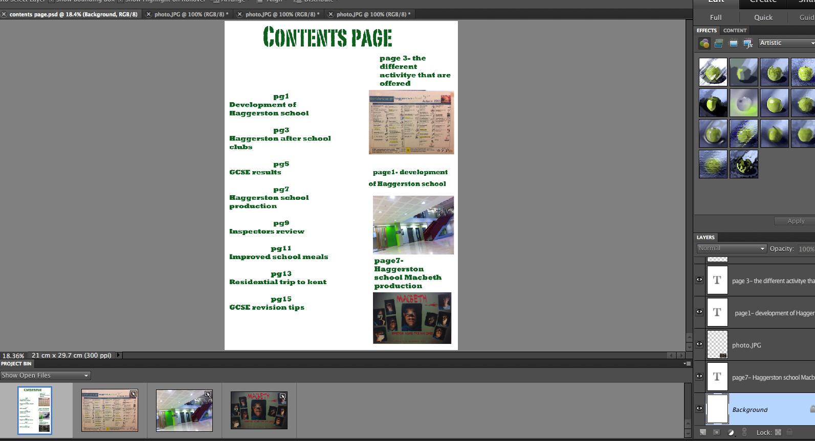
I used the colour green because its one of the colours for Haggerston school, my back ground is white because its simple and it makes my text stand out.


pre- production


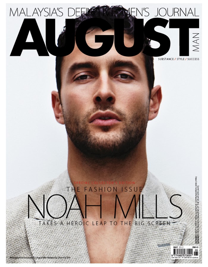
I like this double page spread because the portrait is striking and it stand out
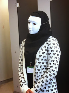
these are some pictures that i took for my magazine


Thursday 10 October 2013
production


so far this is how my double page spread looks i have my pull quote and stand first which i may change the lay out for, but i still have work to do on it as its not finish and things may need moving round
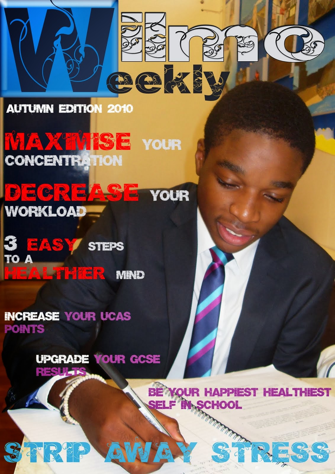
so far this is how my front cover looks although i am still developing my text

As you can see from my last post of my magazine cover i have added more to it.

so far this is how my magazine front cover is looking

Subscribe to:
Posts (Atom)